
Dark design is and always will be a trend. The level of darkness will always vary, but basically, it’s really hard to screw up a simple, dark design. This is especially true for dark UI design.
Not everyone gets it right all the time. There are a few things you have to keep in mind when working with a Dark UI. But, don’t pull your hair out yet. We’re going to go over the elements that you need to keep in mind, and a few you’ll probably want to avoid. This is the basics to dark UI: the good, bad, and of course, the ugly.
Why use dark UI?
To be completely honest here, I don’t think every site can pull of dark UI. It is an interesting design tactic, but it sometimes just doesn’t fit the overall style or brand.
But, putting that aside, it is a very visually striking change. For starters, you don’t see lots of dark UI in the digital world. It’s way easier to put dark text on a light background. Most blogs, for example, choose to go with the light UI simply because they pump out a lot of content.
But, what about the other types of sites? I mean, even a blog can pull it off if they try hard enough. You just have to make sure the dark theme will work. And with that in mind, remember that “dark” doesn’t always mean “black”.

A dark background can be a variety of colors. As long as it’s not completely light, or at least has more than half its elements in a dark color, you could consider it to be a dark UI theme.
To be fair to those who don’t choose dark UI, you have a little more maintenance with a dark background. You have to choose everything (fonts, font size, icons, images, colors, etc.) perfectly. If you have a font that’s too small, it will be engulfed by the dark background. If you have a color that contrasts just a little too much, it can make the entire design theme look cheap.
So, why use dark UI? It’s bold and awesome.
Good examples of dark UI
I’m always a fan of examples, so this is where that portion is going to start. Don’t get me wrong, there are plenty of horrible dark UI examples, but let’s save those for the finale. For now, let’s talk about good examples of dark UI and discuss what they’re doing right.
Spotify
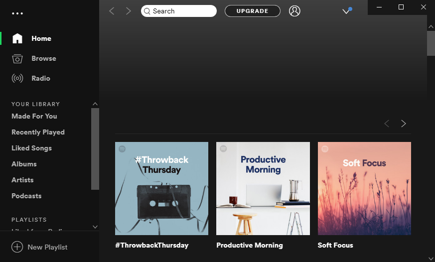
Welcome to the Spotify app. This is the application window that you get when you download Spotify to your device. Spotify is notorious for their dark UI, and it’s for good reason.
For starters, “dark” doesn’t always mean black. There is a slight color gradient that breaks up the normal “black” scheme. It’s very smart because they only integrated the gradient into the middle and right side. If you notice on the left, the sidebar is still solid black, outlining it subtly, but just enough.
Netflix
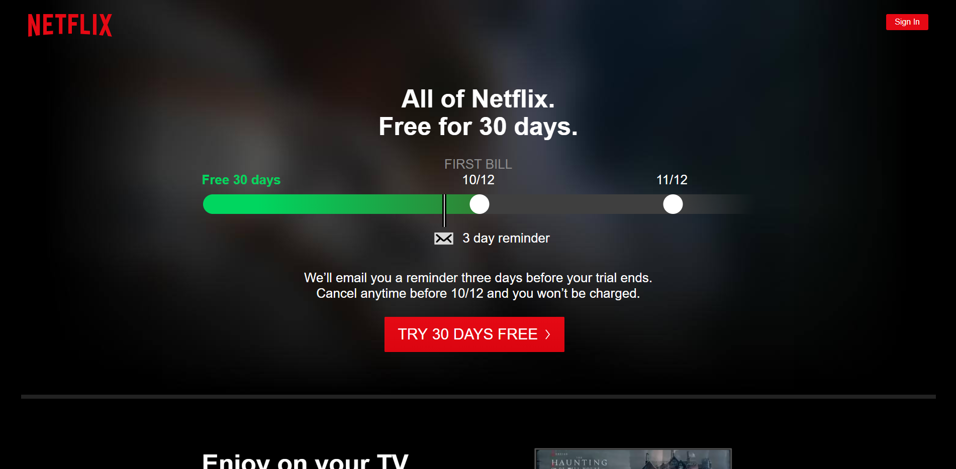
Here’s another name we’re all fairly familiar with: Netflix. Netflix has a beautifully dark UI throughout. Most of us already know the dark UI they have when selecting a show to watch, but few of us probably remember the signup screen.
The reason I selected this screenshot is to highlight another element of dark UI that you need to remember: consistency. You simply cannot have a dark UI in one area, and then switch to a light. Visually, this is kind of an eye sore.
Sony
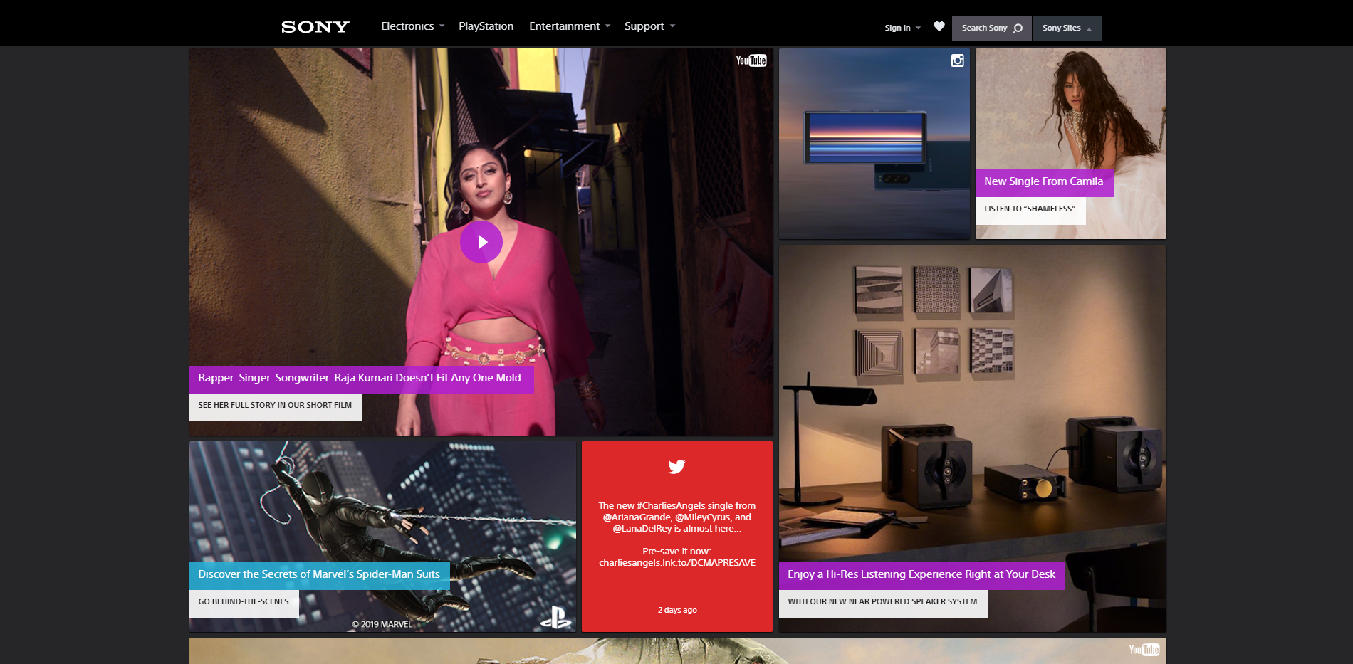
Here we have Sony’s main site. The dark background draws your eyes instantly to the center where all the content is gathered. It’s very, very simple, but it does the job. Plus, Sony’s logo is notoriously white, so a light background would’ve been a poor choice.
So what is Sony getting right? The lack of elements. The dark UI is contrast enough, and they know that. They don’t need to load up their main page with gradients and contrasting colors. They went with black, plain and simple.
The bad and ugly dark UI
In order for there to be good examples of dark UI, there also has to be at least a few bad ones, too. Honestly, we can probably learn the most from bad examples. They teach us what not to do instead of giving us examples that we just copy.

I don’t really like calling anyone out, so we’ll avoid names here and just jump straight to what’s wrong with the UI. To do that, let’s play a little game involving the image above. I like to call this game: Spot the tablet. Believe it or not, there are 2 tablets in that image. Can you spot number 2?
The point of this is to show you that not all images work well with dark UI. Sure, they could of had limited options. But this all points back to one of our original points when using dark UI – pick your images wisely. The fact is that the tablet blends in almost perfectly into the background. It doesn’t work.
This one I want you to really look at. From a glance, it looks pretty okay. There’s nothing special about it, but it’s certainly not the worst thing I’ve ever seen.
What they did wrong here is the overuse of contrasting colors. Bright redish-pink, lime green, and neon blue all come clashing together to make this app look like the inside of a cheap nightclub. It simply doesn’t work.
Now, if they had gone with fewer colors, or maybe turned the intensity of the colors down a little bit, this could work very well. But, as it sits now, there are better designs out there.
Additional things to avoid with dark UI
We hit the basics on things to avoid with dark UI (too much color, poor image choices, etc.) but there are a few guidelines that I want to leave you with here:
- Avoid a lot of text
We briefly mentioned how choosing the right size font makes a big difference. Well, the amount of text does, too. If you have too much light colored text on screen, it can be hard to focus.
- Avoid a lot of content
In general, you’ll probably want to avoid too much content on screen at one time. Again, it can be very hard to focus.
- Don’t use too many colors
Even if the design has nothing but dark colors, using too many can cause a lot of headache. With a dark UI, your brain will automatically be attracted to anything that stands out. Including varying colors. The quick change for your eyes can and will be straining.
There you have it everyone: dark UI. Overall, it can be quite a challenge to pull off dark UI design. But, if it’s done right, it will definitely make you stand out. But of course remember, dark UI is absolutely not for everyone.


Leave a Reply