
Grey Goose has revamped their visual identity and we love it. The redesign was done by London, UK-based Ragged Edge.
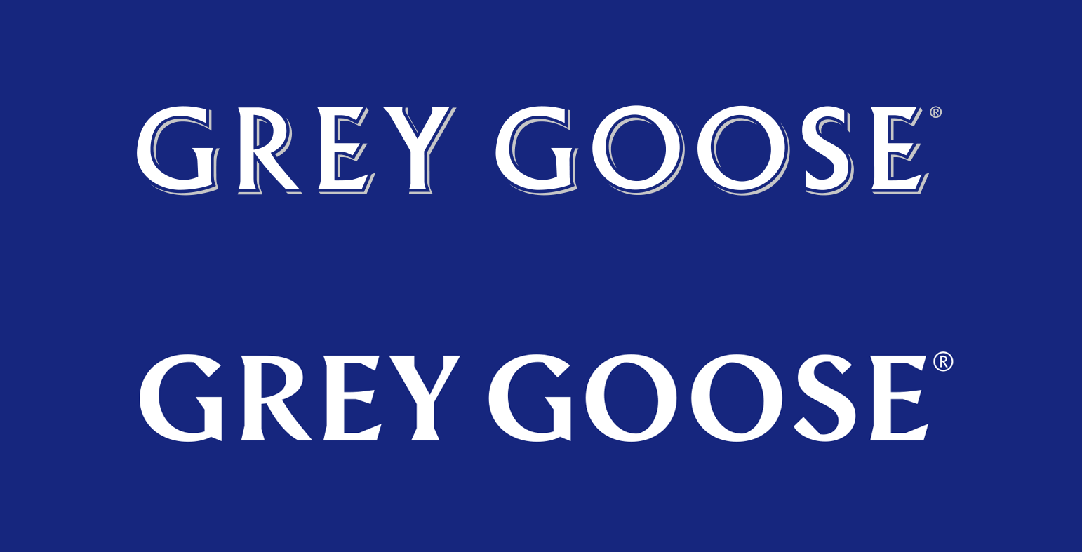
“We needed a bold statement. So we started by redrawing the logotype from scratch – the biggest change to the brand’s identity since its launch in 1997. [The] bespoke type is more contemporary, with just a hint of swagger. The perfect complement to the iconic lone goose symbol.”
When it comes to the goose logo, I have some reservations regarding just how distinctive the goose will actually be.
Although I love the movement towards a more minimalistic icon, the 3D texturing that the logo previously had gave it character and a more luxurious identity.
Ragged Edge has successfully made the brand feel more accessible in their attempt to, as they said it, “build a flexible identity full of optimism”
![]()
From a marketing perspective, the shorter tagline that spells just “Vodka” now instead of “World’s best tasting Vodka” makes a lot of sense. Most people shop for alcohol based on the label. In recent years, more and more consumers will go for a more minimal tag. This is a trend we’ve seen in wine bottles as well.
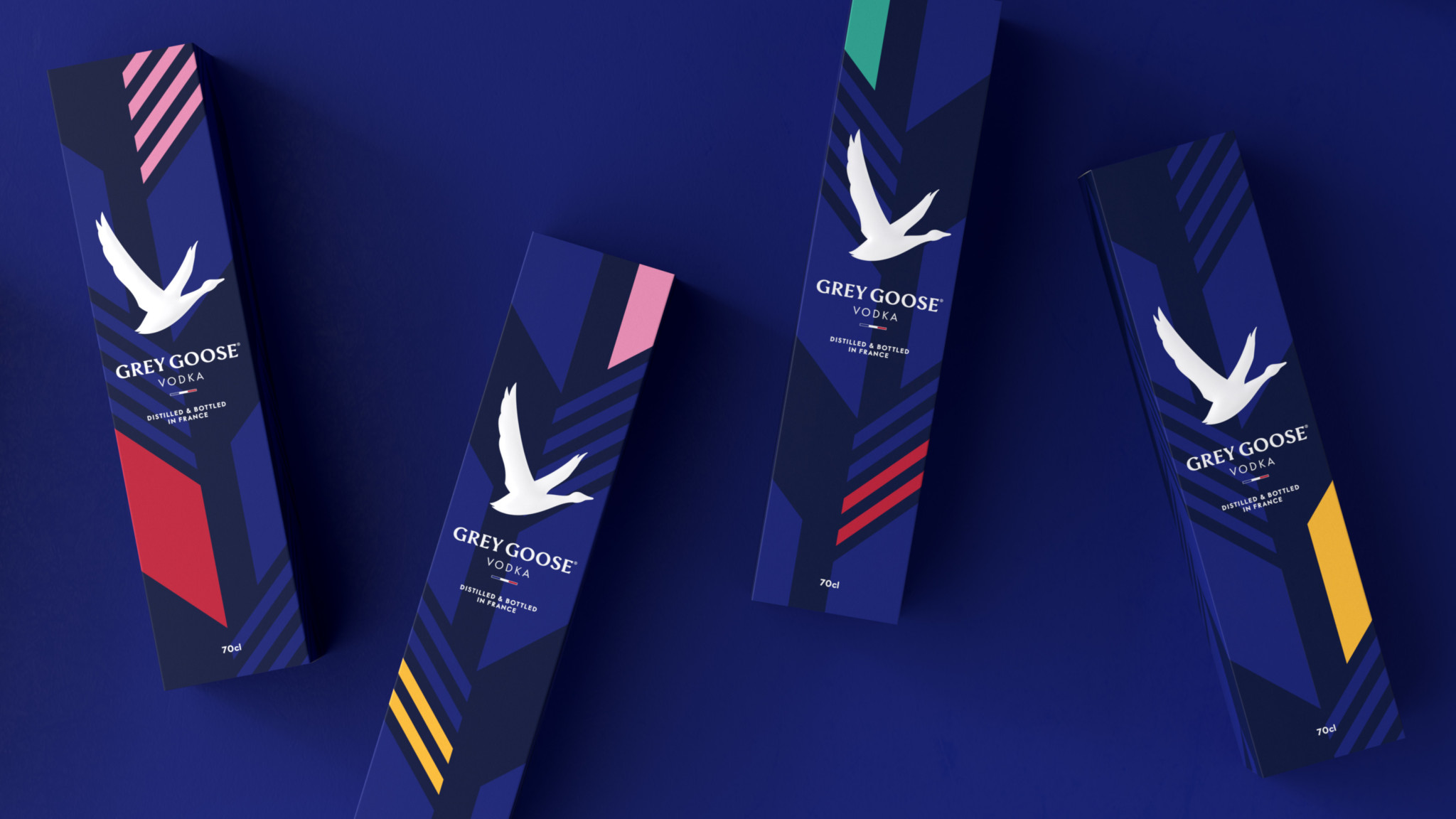
However, having a splash of color on your label does help a lot as this study proves. This is why the new Grey Goose packaging will definitely draw your attention in a duty free store. The new subtle patters and their dynamic with the other visuals are definitely my favorite part of the redesign. 
Now back to you. What do you think about the Grey Goose Vodka redesign? What do you like and what do you dislike about it?
Let us know in the comments bellow.


Leave a Reply